Simpler is often better


Tax Policy Associates has mapped 81 of the UK's 90 taxes onto a single interactive chart, ranked by revenue raised in 2024/45. The other 8 yield nothing at all, so they don't appear.
The various taxes on employment account for almost half of all tax revenue. Add on VAT and corporation tax and you’re looking at about 70 per cent of all tax revenue.
The article itself is a model of clear writing on a complicated subject. It explains what the tax system is, why it grew this way, and what that means, all without losing the reader.
I'm less convinced by this interactive chart.
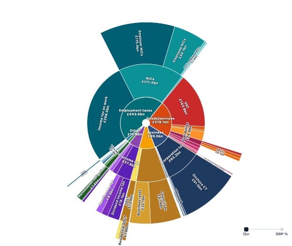
The top level has lots of unreadbable segments and the totals near the centre are not easy to distinguish.
It has drill-down features which the authors probably see as a gift to the reader, but they add friction.
A simple bar or column chart, colour-coded by tax type, would let the reader see all 90 taxes at once, including the 9 that raise no revenue, which would appear as empty bars and make their own quiet point.
Which raises the real issue: when we communicate financial information, simplicity is almost always a better starting point than sophistication. Interactivity can be justified, but the burden of proof is on the designer, not the reader.
The article is worth reading for its content. It's also worth studying as an example of how to explain a complex system to a non-specialist audience.